
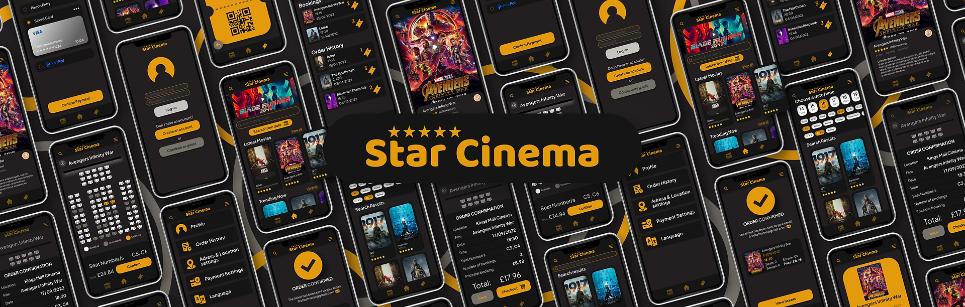
Star Cinema
A quick and convenient way to book cinema seats
Where
London, United Kingdom
Role
Designer Researcher
What
Native Mobile App
Category
Cinema booking, Seat booking
Why
Portfolio Project
When
Sep 2022 - Oct 2022
Quick Summary
Star Cinema is a cinema seat booking app that Focuses on improving and simplifying the process of booking and choosing seats at a cinema and making options easily accessible.
The app uniquely offers the user the choice of chosing a film then picking the time, or selecting a time and then the movie.
The Problem
How can we create an app that allows users to choose between selecting a date then seeing the available films and selecting a film and seeing all the available dates and times.
Challenges
-
Create an intuitive and simple to use UI that can accommodate the many functions needed.
-
Create a cohesive interface for familiar and unfamiliar users.
-
To make the application fun and engaging to use.
The Goal
To design an app that allows users to easily and effectively book tickets to the cinema
Market Research
The Claim
the Cinema industry has been growing rapidly even after a strong decline in 2020
The problem
the Cinema industry has been growing rapidly even after a strong decline in 2020

Competitive analysis
I analysed 4 of the most popular apps in the same market - I studied the style, ease of use, overall experience and reviews to better understand similar apps in the same market.
Cineworld

Good
Bad
-
Visually pleasing
-
Brings you straight to the movie election
-
IMAX, QR codes for Plus Annual service
-
Easy to use on the go
-
Seat selection is smooth
-
Overwelming options
-
Difficult to navigate
-
Few accessibility options
-
Difficult to sort by Genre and age
-
Constaint loggin out
-
Hard to find film times
PVR Cinemas
Good
-
Good search feature
-
User friendly
-
Wide range of movies
-
4DX, IMAX, gold membership
-
App personalization
-
Accessible cinemas, closed captioning
-
Good customer support
-
Aestheticaly pleasing
-
Lots of information
Bad
-
Overwelming options
-
Funtional problems
-
Can be very slow
-
Cluttered UI
-
Can be hard to navigate
-
Sometimes too much information
Vue
Good
Bad
-
Clean style
-
Exclusive films
-
Easy to contact customer support
-
Simple and easy to navigate with clean and with strictly relevent information
-
Seat selection process is easy
-
easy to find times and options
-
No mobile app only a website
-
Can be slow to load
-
Few features
-
Few accessibility options
-
Can be difficult to navigate
AMC Theaters
Good
-
Clean and engagin style
-
User friendly and easy to navigate
-
Prime AMC, Dolby Cinema, IMAX
-
Good customer suport
-
Easy to navigate
-
Simple and clear style
-
Engaging and functional
-
Very friendly and to the point
-
Good customer intimacy
Bad
-
Slow to load
-
Fewer features than others
-
Few accessibility options
-
Constant crashing problems
-
Can be difficult to select movies
User survey
I conducted interviews and created empathy maps to understand the users I’m designing for and their needs.
A primary user group identified through research was everyone who likes to go to the cinema to watch a movie, and anyone who would like to use an app to book their tickets.
Some of the frustrations users had included being able to see all the options easily and clearly. Constantly having to go back and forth to check times and availability can be quite a hassle. Other user problems included difficulty using the seat allocation system and working out where to sit.
Time
Movies can take a while and many are getting longer. Working out when the movie starts and ends so that the user can plan effectively is very important.
Accessibility
Interface
Pushing deals
Working out if the movie has options such as subtitles or if the cinema has step free access.
Difficult to use and understand interfaces can make it difficult to make an informed decision
Many apps can often be filled with aggressive marketing to get users to spend more money than they intend
Initial reseach shows
Many cinema booking apps can be complicated and overwhelming. Many websites and mobile apps have many popups for deals and cluttered information. This can also lead to a loss of technical performance making the app frustrating at times.
Who are we designing for?
I created two archetypes to further understand our user's needs and pain points
Young busy bee
Behaviours:
Time-poor, has a strict schedule, and is very familiar to using technology and going to the cinema.
Goals + Motivations:
-
Wants to find a way to spend more time with friends and family
-
To watch more good movies
-
To get promoted to a higher role
Needs:
Something convenient and accessible to work around their busy work schedual, special deals and offers to get cheaper tickets.

Tech nervous middle aged adult
Behaviours:
Enjoys watching movies and has lots of free time, but often finds using technology difficult.
Goals + Motivations:
-
Wants to try new things, travel and explore more
-
Wants to spend time with their family
-
Wishes it was easer to decide on what movie to watch
Needs:
Something convenient and accessible to work around their busy work schedual, special deals and offers to get cheaper tickets.

Flow Diagram
To outline all the necessary functions I created a simple flow diagram of the main tasks the user can do. The shapes and colours show the type of action being executed.

Low fidelity wire-frames
Once the flow diagram was established. I started creating the low fidelity wireframes of the main flows.


High-fidelity UI Design
once the initial flow was complete, I started by creating a couple of the main screens of the app. I started by defining the fonts and colours
Colour palette
Accent, primary, secondary, tertiary, background
#E39B0D
#151515
#221F1F
#C6C3BF
#767169
images used
film posters used as thumbnails for movies
Font
Plus Jakarta Sans
Regular, Medium, Bold
AaBbCcDdEeFfGgHh


Alignment and grid
I picked a 4 point grid for the project working in multiples of 4 for all of the margins and gaps between lables, icons and elements.

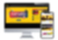
High-fidelity prototype
I connected my high fidelity designs into a clickable prototype. That will allow me to test the app on a first group of users.
The prototype can be live-previewed at: [Link]

Prototype validation
I validated my prototype with 4 users. Each were given a subset of the prototype dedicated to the category, product and product detail views. I wanted to be sure users understant that there are more options within categories, and that each option also has a dedicated page.
This was tested in person where I indroduced the user to the app and asked them questions. The questions were dedicated to finding out wheather the category and film option tabs were easy enough to understand.
Study results
-
some users found the date system confusing.
-
Users found the seat booking system confusing
-
Users wanted more consistency in the design
-
Users were confused with some of the wording.
-
Users missed a few features
Prototype Update concept
Because of time constraints. I wasn't able to run a second usability study on the updated prototype. However I have updated it by
Impact
The app is easy to use, users found the system easy to navigate and make a booking. Users were satisfied after. I was pleased to find out that my system of two ways of booking worked with 50/50 split on weather or not users would book from a movie of from a date
What I've learned
I found that it is more important to focus on the layout and the structure of the process before focusing on the details and style.
1
Continue to improve the design, could we improve the seat booking screen? could we make the prototype more like the final product? Could we improve or include more animations.
2
Conduct more usability studies to see if there are any more pain points.
3
Conduct more competition research to check how competitors design their apps.
Project Summary
During this project, I managed to evaluate the market, do a quick user survay, perform a mini usability study (in person), create a set of low fidelity wireframes, connect them into a prototype and build them out to high-fidelity with beautiful UI designs.